how to level up your picture with the grid feature | rule of thirds
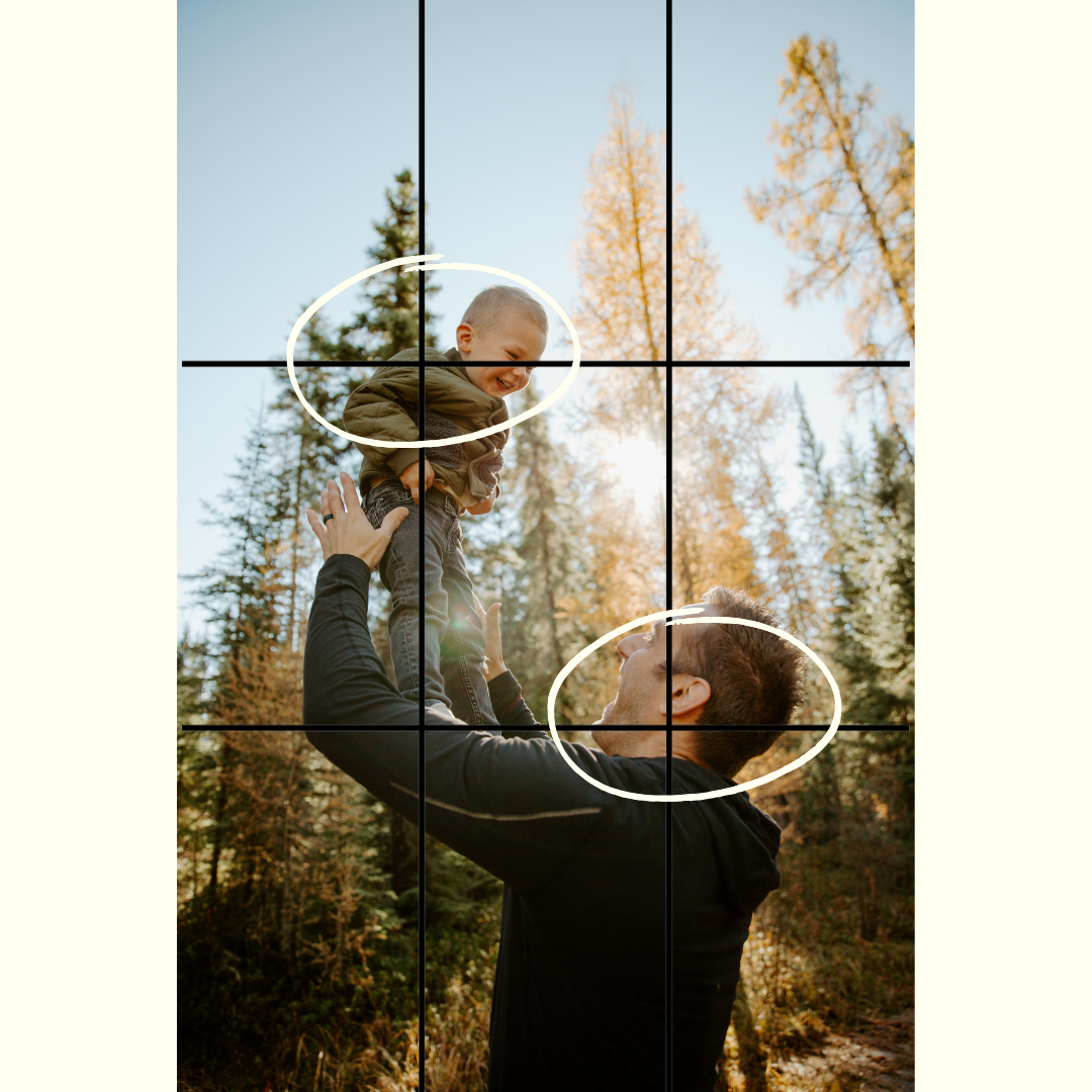
Now, I’m not a theory expert by any means, but using the rule of thirds often makes your pictures more visually pleasing! On a very basic level, the rules of third is simply using the 9 point grid to make a picture more interesting.
how to use it:
place the subject of highest important where the grid lines meet, as circled below
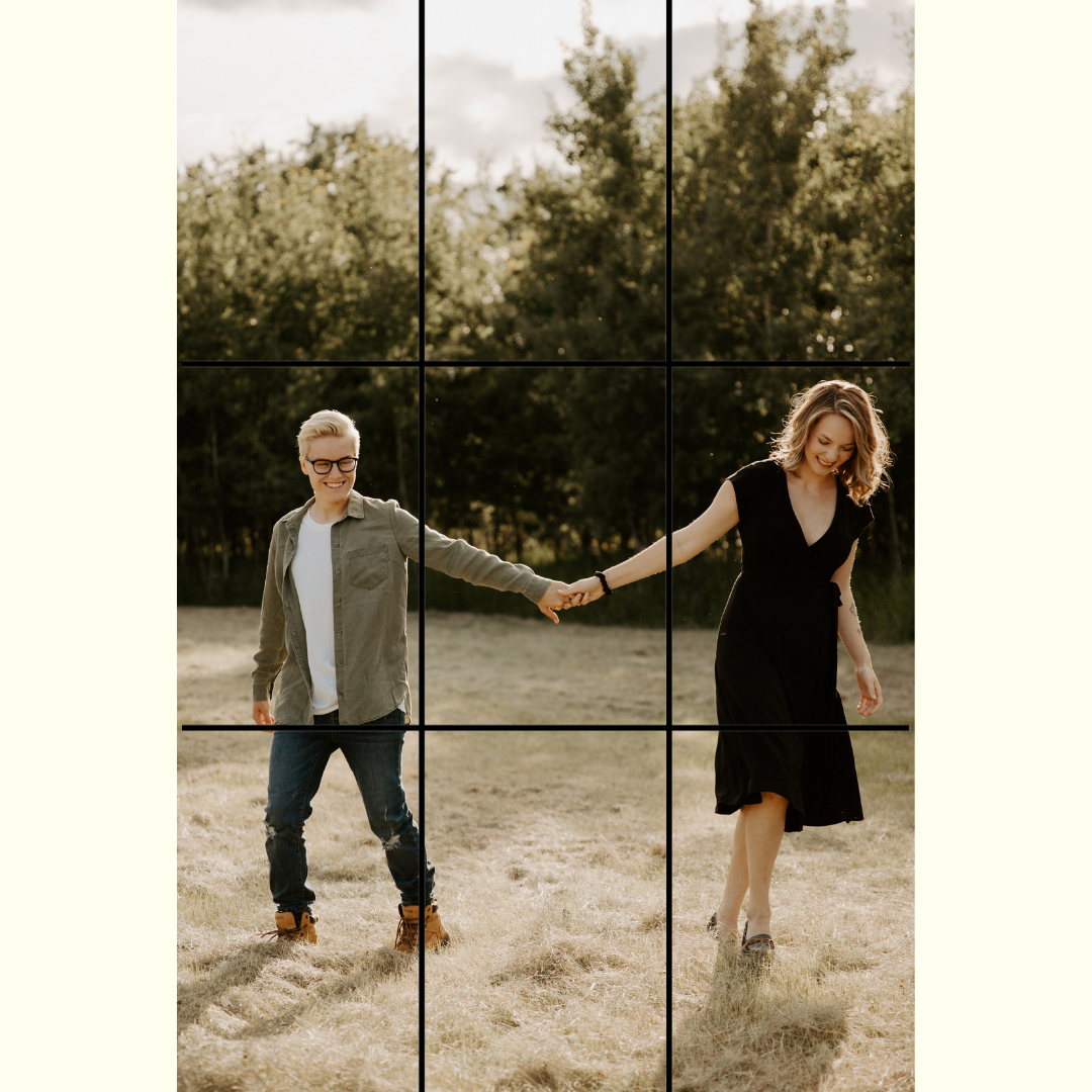
fill 1/3 or 2/3 of an image, for instance the couple holding hands in the field, each person is in a third
use thirds for background/landscapes too, have the land take up a 1/3 and the sky 2/3s or vice versa
tips & tricks
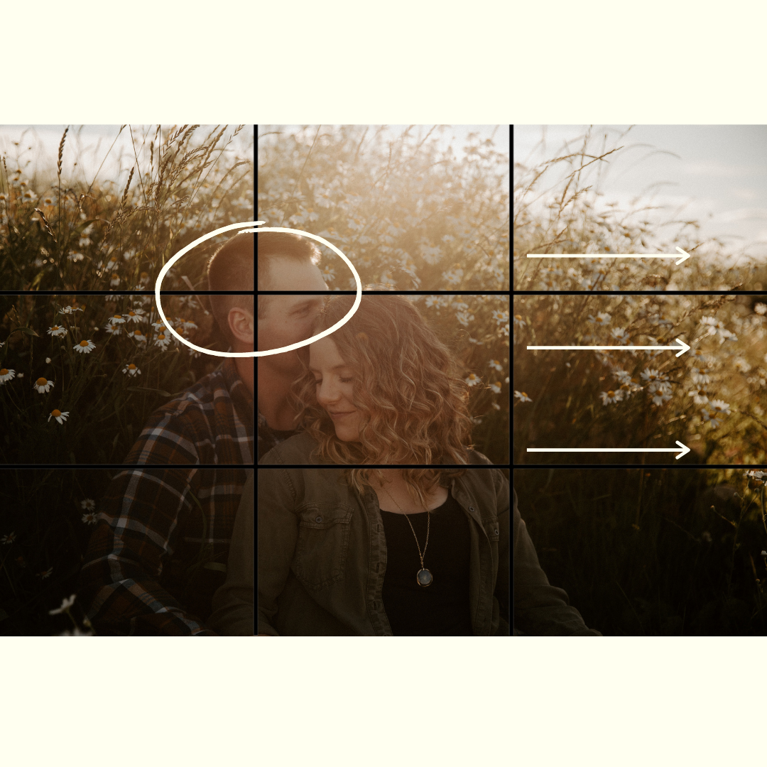
make sure your subject is looking towards the “empty” space in your picture (like the couple sitting in the flowers)
use symmetry and the rule of thirds together! (used in the couple sitting in the flowers with Shelby’s face in the centre and in the couple in the field where their hands are in the centre)
This is theory / a rule, it doesn’t need to be perfect, and you don’t have to follow it 24/7! Photography is all about having fun and trying new things!


